Introduction to Color
Visible Light
Visible light is the only portion of the entire electromagnetic spectrum that is visible to the naked eye. The electromagnetic spectrum contains all of the wave- lengths of energy emitted by the sun. We can see color because objects, according to what they are made of, reflect back certain wavelengths of light to our eyes. The wavelength that is reflected back is the color that we see.
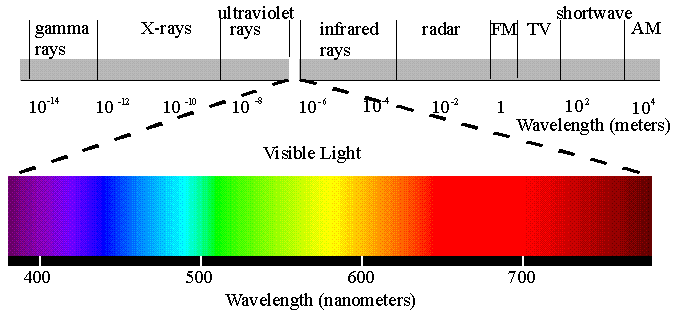
A larger more detailed representation of electromagnetic radiation
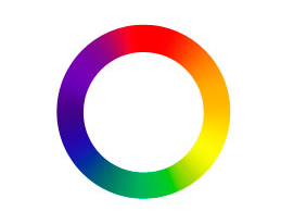
Taking that spectrum of visible light and bending it into a circle creates the following form, a circle.
Sir Isaac Newton
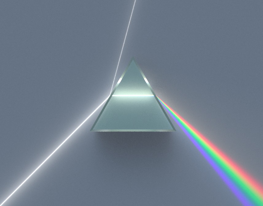
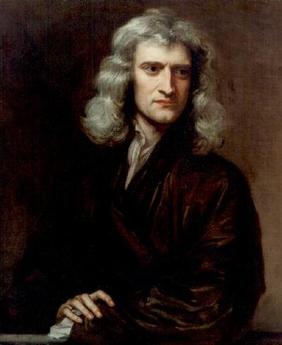 In 1666, Sir Isaac Newton, an English phycisist observed the color spectrum as it exited a prism. He saw that the color of an object is the result of the object interacting with already colored light. He noted that objects did not produce color by themselves.
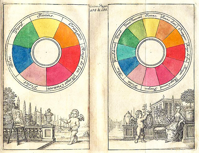
Claude Boutet created one of the earliest documented color wheels seen below in 1708. Ideas about color grew out of the Scientific Revolution and then the Enlightenment. Studying the world through direct observation, using the primary senses, led to advances in optics and the development of numerous theories on color and color interaction.
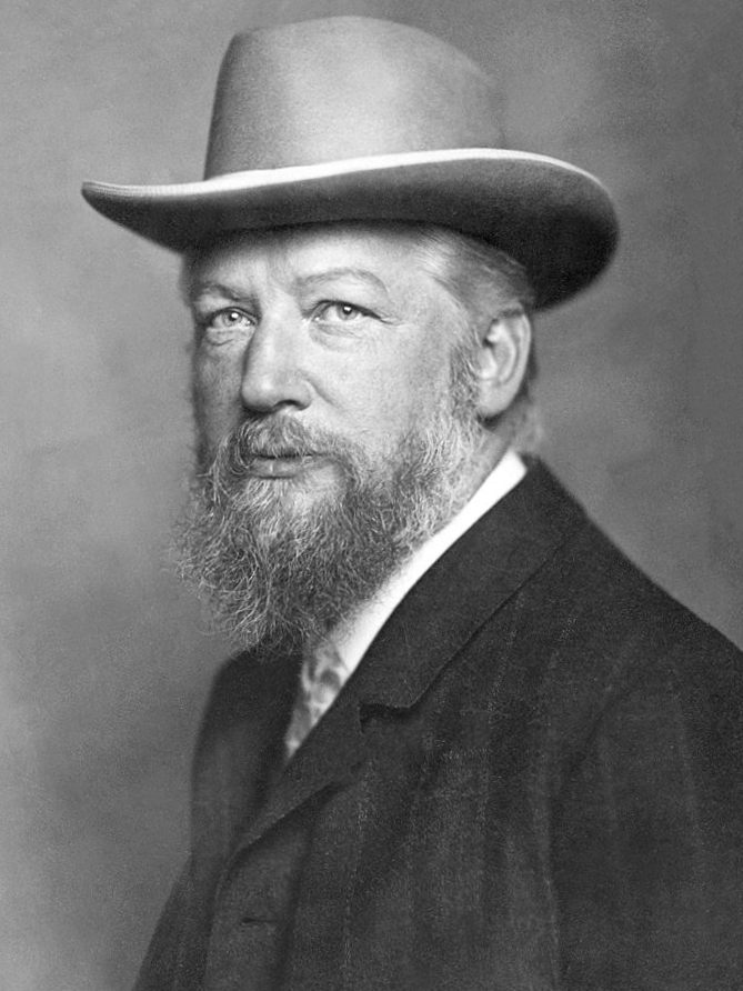
Sir David Brewster
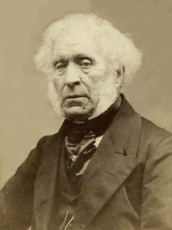 In the early 19th century, Sir David Brewster, a Scottish phycisist theorized the primary colors were red, blue, and yellow. He was the first to believe that three colors carefully selected could yield all the colors of the spectrum when properly mixed.
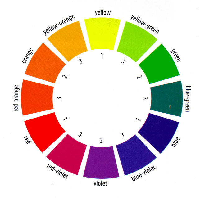
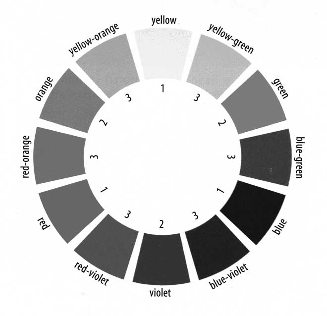
Color Wheel based on Brewster's theory of red, blue, and yellow as primary. Primary colors are marked with a 1. Secondary colors are marked with a 2, while those marked with a 3 are intermediary colors.
Albert Munsell
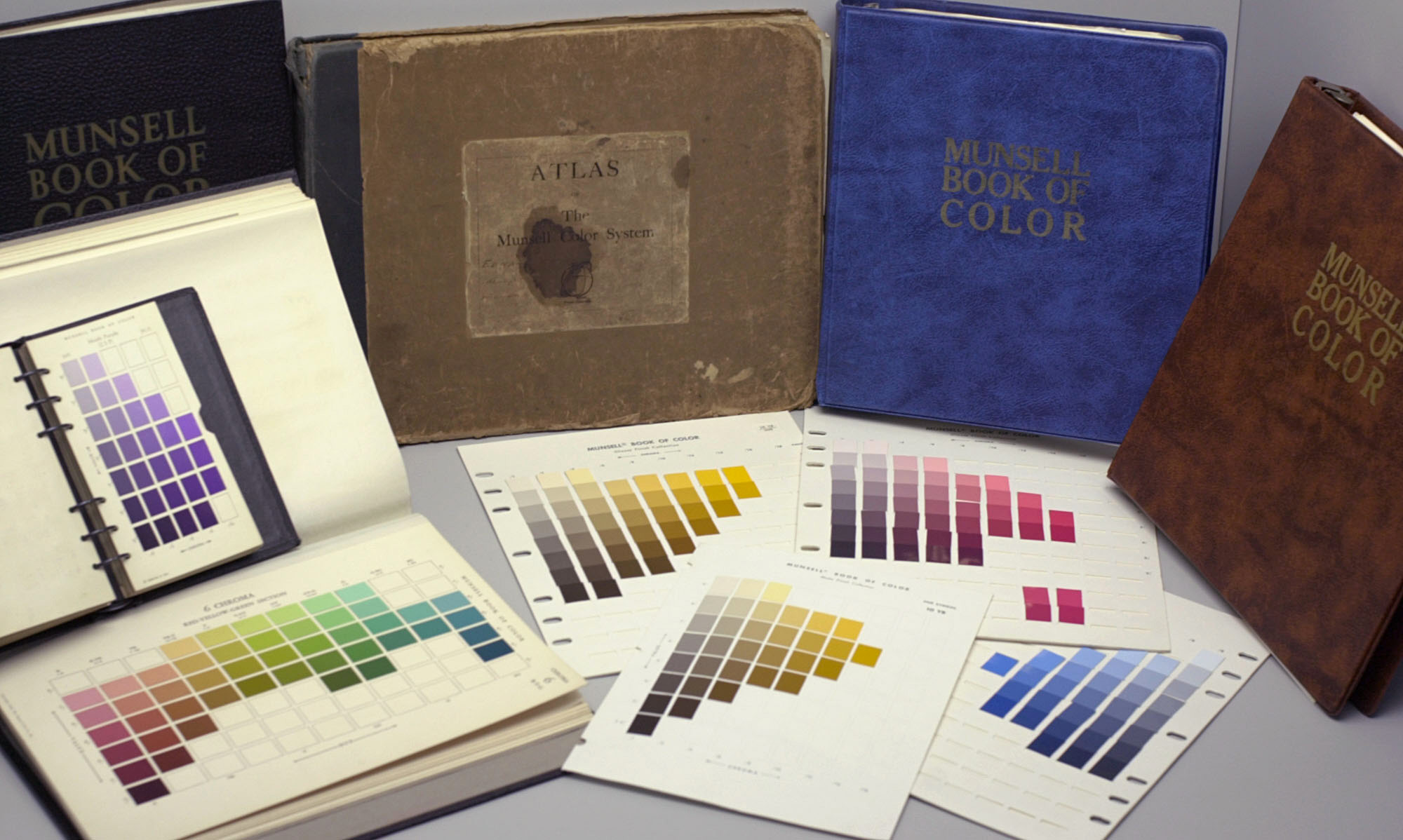
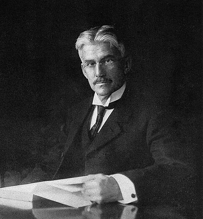 Albert Munsell was a painter who taught at the Massachusetts Normal Art School (now the Massachusetts College of Art and Design) in the early 20th century. He came up with a system for organizing color based on perception. He developed a numeric perceptually-uniform system that used value, hue, and chroma. During his lifetime he published two books on color and worked to incorporate color education in schools starting in elementary school.
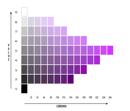 Page from Munsell's text on color showing red-violet. Note the numbers used to describe value and intensity. In his system some hues have a larger range of intensity such as this red-violet when compared to the yellow-ochre in the next image.
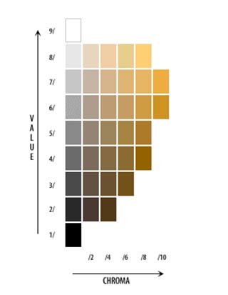 Page from Munsell's text on color showing yellow ochre. Note the numbers used to describe value and intensity.
 Munsell's color tree (three dimensional model of all of his color pages). Darker values at the bottom, lighter values at the top, increasing intensity as one moves outward from center vertical axis.
 Munsell's color wheel
Wilhem Ostwald
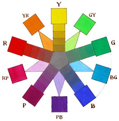
 Wilhelm Ostwald, a German, who won the Nobel prize in chemisty in 1909 and later taught color theory for years at the Bauhaus school, developed a color wheel with eight colors. His teachings on color went on to influence generations of artists, architects, and designers including Josef Albers, Oskar Schlemmer, Laszlo, Moholy-Nagy, Paul Klee and Wassily Kandinsky. His theories were taught in German public schools and incorporated in German design education.
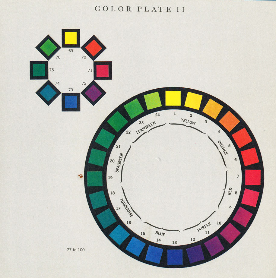
Plate II from Ostwald's text, The Color Primer showing a simplified and expanded version of his color wheel.
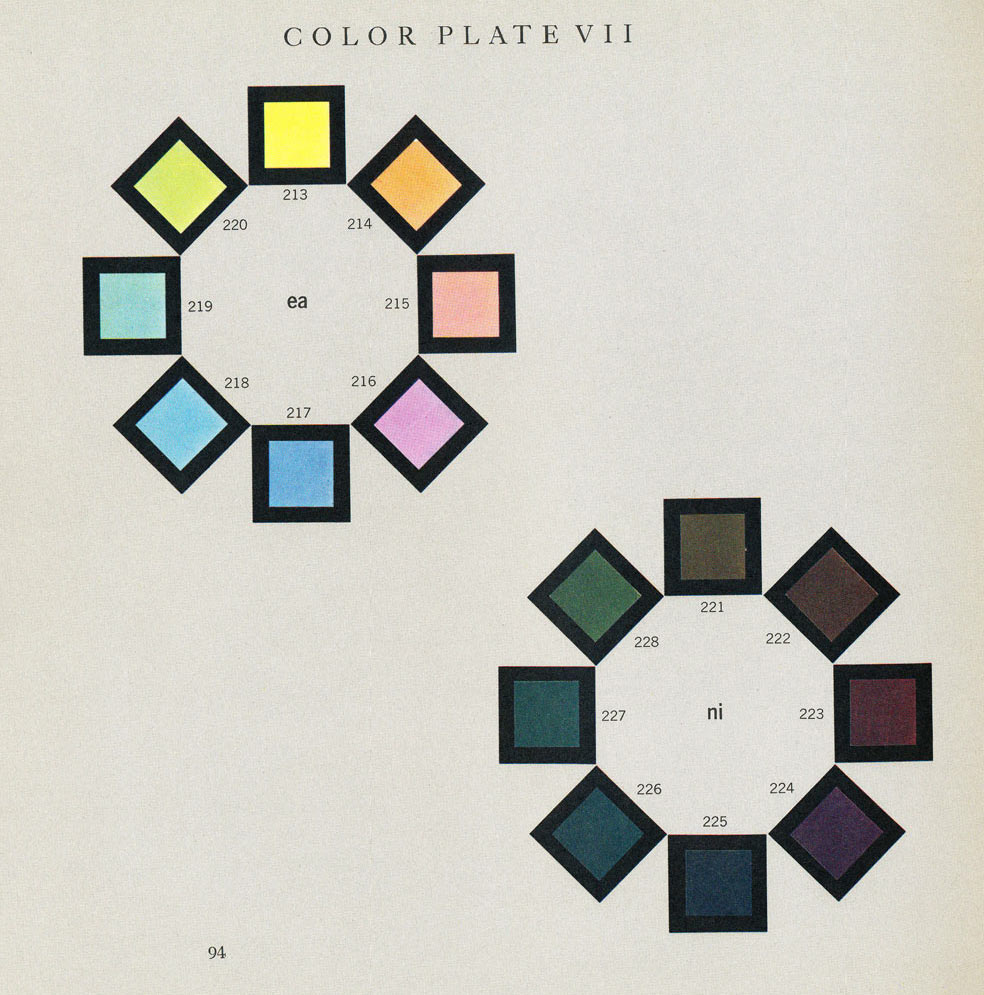
Plate VII from Ostwald's text, The Color Primer showing tints and shades of his color wheel.
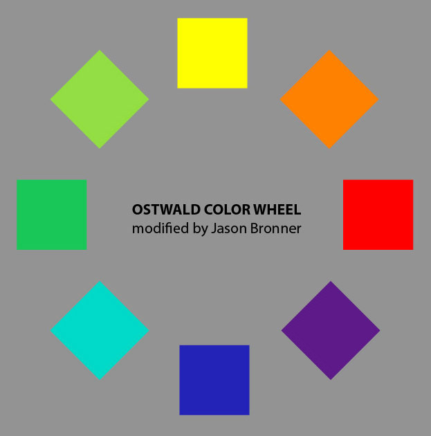
Modified Ostwald Color Wheel.
Hue
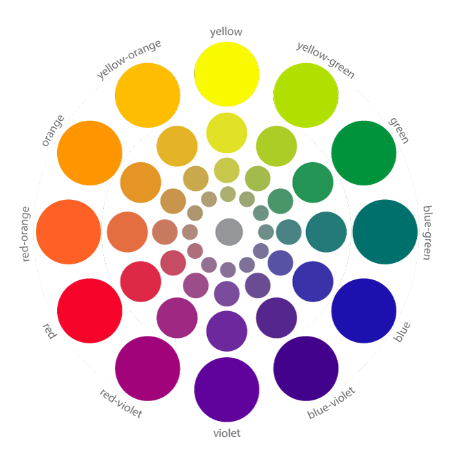
Hue refers to the location of the color on the color wheel. For example, colors called lilac, amethyst, and lavender are in the hue of violet (purple). Colors called vermillion, pink, and scarlet are in the hue of red. Colors called pumpkin, amber, and peach are in hue of orange. Colors called emerald and forest are in the hue of green. The hues on the color wheel are the purest, most saturated forms of the color.
Value
We already know that grays, white, and blacks represent values, (middle, light and dark, repsectively). Colors also have values. Yellow is a light value. Blue is a darker value than yellow. Seeing the values in colors in challenging, but an extremely important skill for a painter. If a painting does not work well in black and white, it is less likely to be successful in full-color. Humans tend to be skilled at seeing subtle differences in hue, but we often find subtle value changes to be more difficult to detect.
Saturation
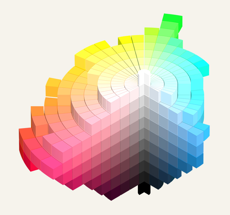
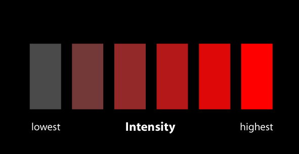
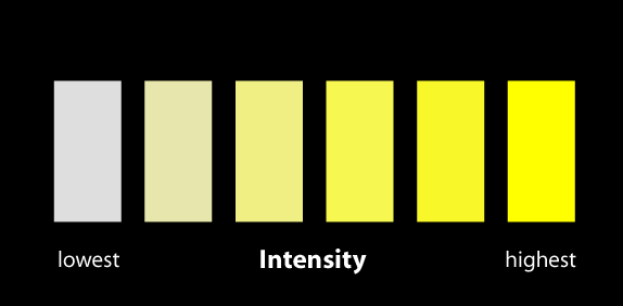
Munsell categorizes his colors using hue, value, and saturation, also known as intensity or chroma. Saturation refers to the colorfulness or purity of a color. High saturation colors are seen as pure or highly colorful whereas low saturation colors are closer to grays or neutral browns. Below are some graphics showing changes from low to high saturation, (chroma or intensity).
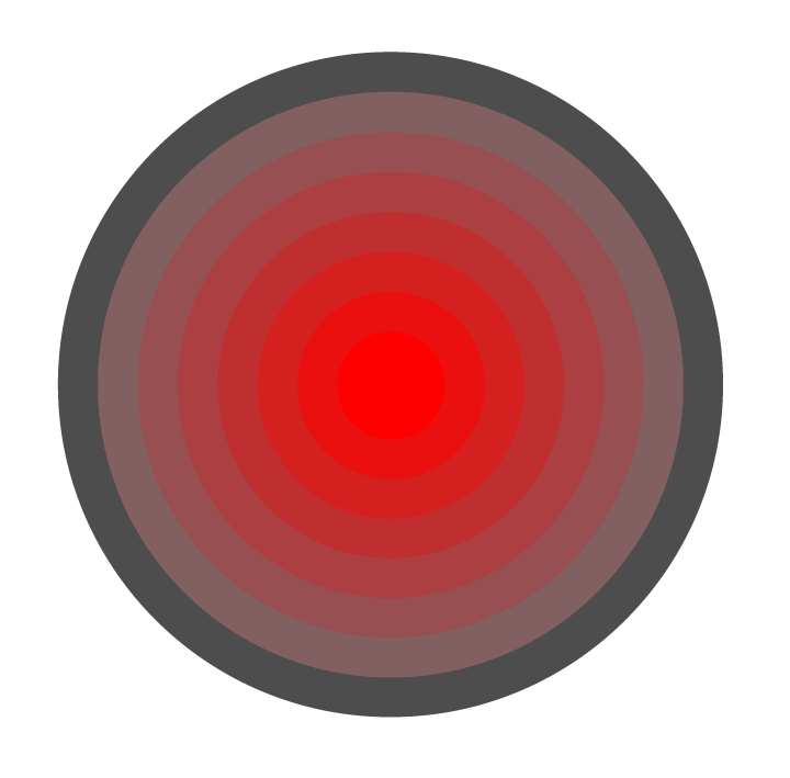
Attention to chroma and careful manipulation of it can yield powerful results. For example, the illusion of an internal glow can be created through adjusting the chroma even without adjusting the value as in this image with concentric red rings. The center appears to glow due to the change in chroma. Below it is a black and white image of it. Notice how the values are almost all identical.
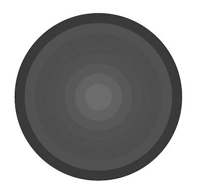 Here is a smaller version of the red chroma change image seen above now transformed into only black and white. Notice that the values are almost identical.
As one moves toward the center of the circle the chroma drops. At the center is a neutral color (gray). In theory, colors when mixed in near equal parts with their complement (the color directly across from it on the color wheel), it will create a neutral or gray color as seen in this image.
When mixing colors and you desire to lower the chroma, I encourage you not to jump to black or white (or even gray), but to instead start with a bit of the complementary color to lower the chroma of your color. This often results in richer color interaction.
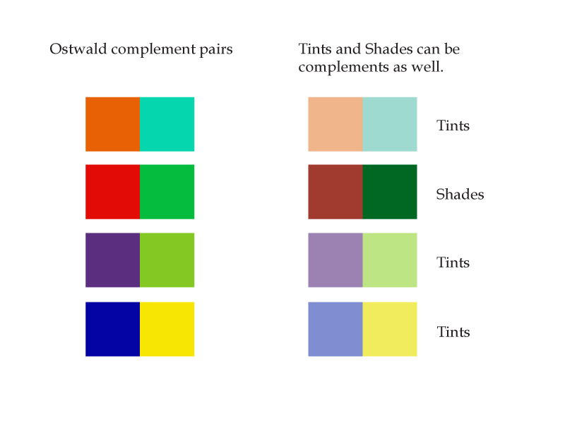
Complementary Colors
Colors across from each other on the color wheel are called complements. When placed near each other they tend to make each other look more colorful or intense. When a pair of complements are mixed with each other they create a neutral color. Examples of the use of complementary colors can be found here.
Analogous Colors
Analogous colors are sometimes referred to as a family of colors. They all have something in common and are colors next to each other on the color wheel, generally two or three next to each other. For example, yellow-orange, yellow, and yellow-green are analogous. They all have yellow in them.
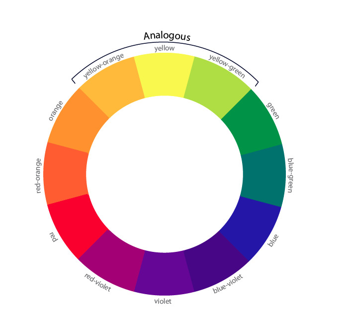
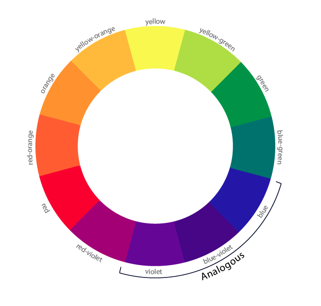
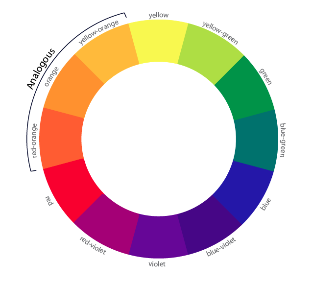
Examples of the use of analogous colors can be found here.
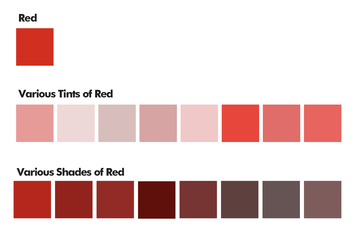
Tints and Shades
When one adds white to a color it is referred to as a tint.
When one adds black to a color it is referred to as a shade.