Pigments and Color Temperature
Warm and Cool Relationships
You likely can see that some colors are warmer than others. For example, most can see that red is warmer than purple, and purple is warmer than blue. One fact about pigments that one may not have considered is that some reds are warmer than others and some blues are cooler than others. In the image below there are four pairs of pigments: two reds, two yellows, two greens, and two blues.
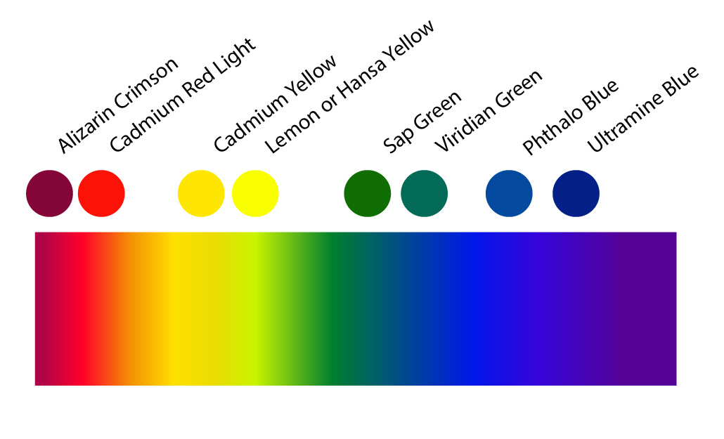
Look carefully at the colors above. Can you see that alizarin crimson is cooler than cadmium red? Lemon yellow is cooler than cadmium yellow. Sap green is warmer than viridian green. Phthalo blue is warmer than ultramarine blue. But why does any of this matter? It matters for at least two reasons: Color mixing and rendering form, space, and light.
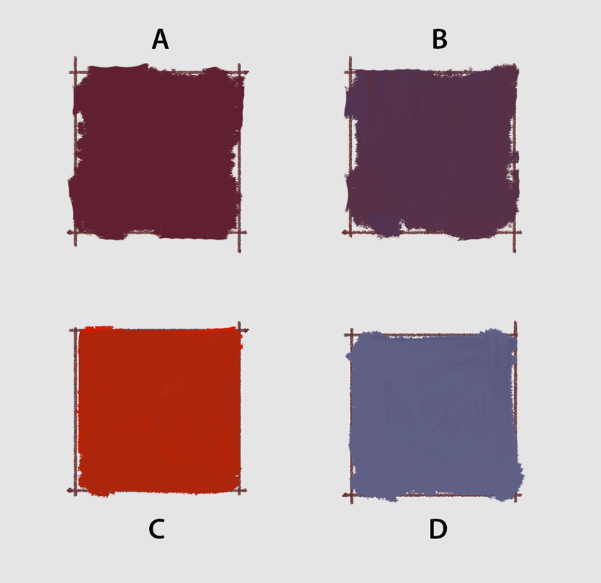
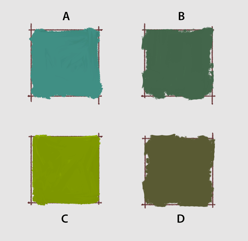
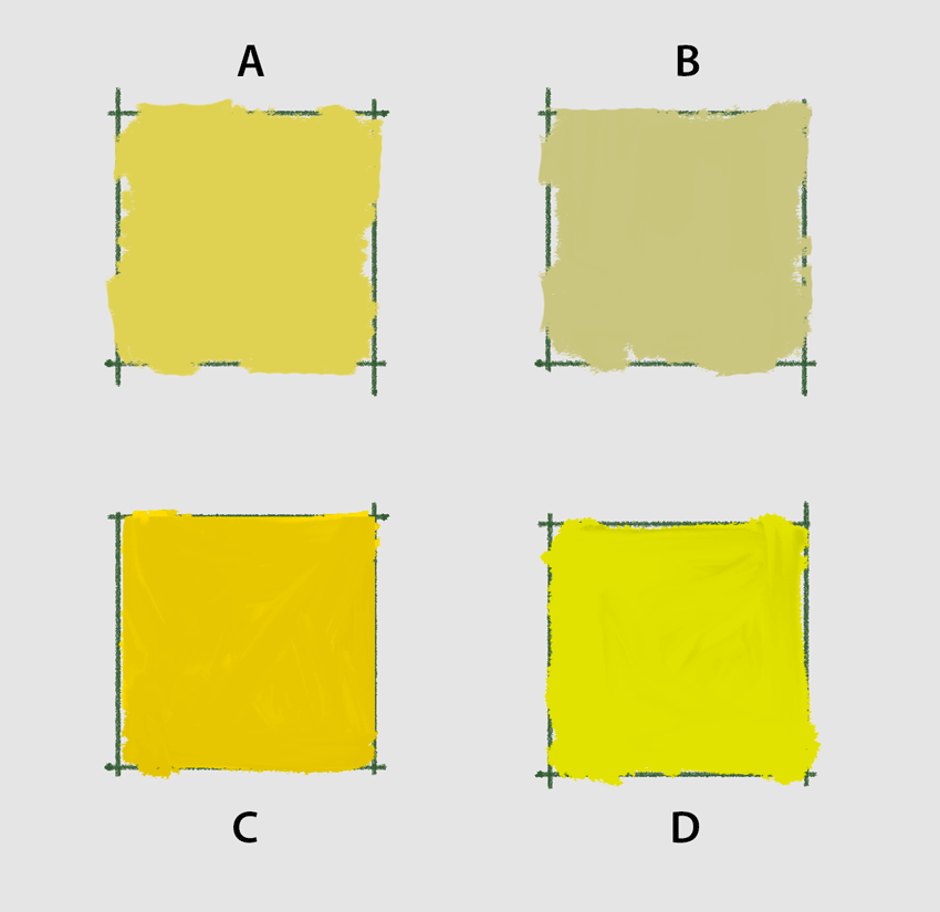
Which is warmer, A or B?
Take a look at the sets of images below. Compare the temperature of each square versus the others in its group. Do your observations match the description underneath each image?
Temperature and Color Mixing
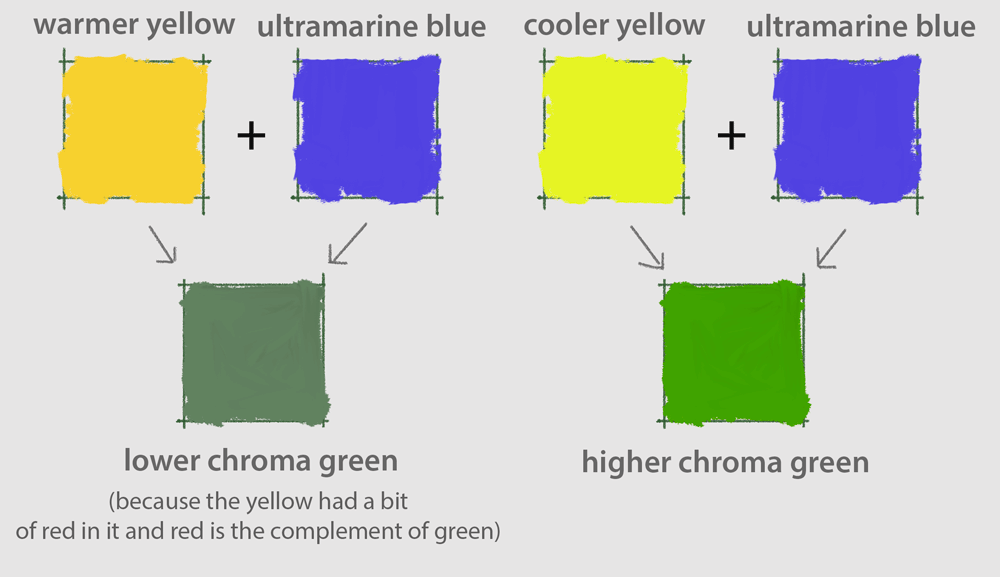
If you do not have a tube of green paint, and want to mix up a green on your palette with some blue and some yellow this information is useful. For example, if you want to mix a higher intensity (higher chroma) green, which yellow and which blue should you use? It does matter. A cooler yellow, the yellow that leans towards blue will when mixed with a blue make a more saturated green, whereas a wamer yellow (cadmium yellow) mixed with a blue will create a less vibrant green because cadmium yellow has a bit of red in it (and remember, red and green are complements and when mixed they create a neutral). So cadmium yellow used in making a green results in a lower chroma green or a pre-neutralized green. At times, one wants a more neutral green, so this can be useful as well.